Simplifying payments for the next-gen India
 Pp
Pp
The problem
A payments app in a crowded Indian market needed to feel trustworthy, modern and distinctly Indian, with the UX already locked by the client's in-house team.
The approach
We ran a visual heuristics and harmony audit inside the existing flows, benchmarked Indian fintech visual trends, and studied where 3D elements genuinely aid clarity rather than decorate. That included the cultural read on purple in Indian design: spiritual, aspirational, modern.
The build
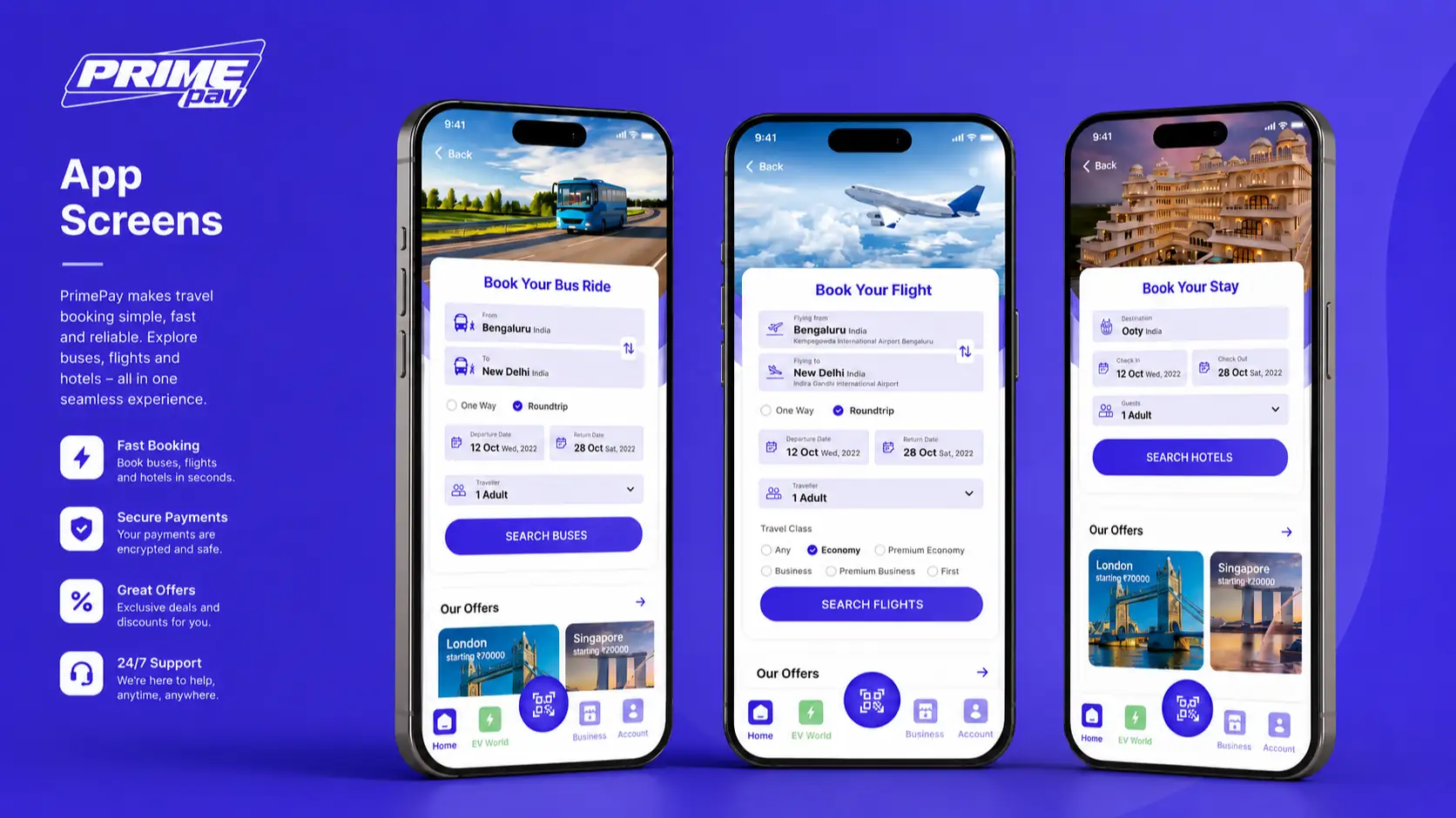
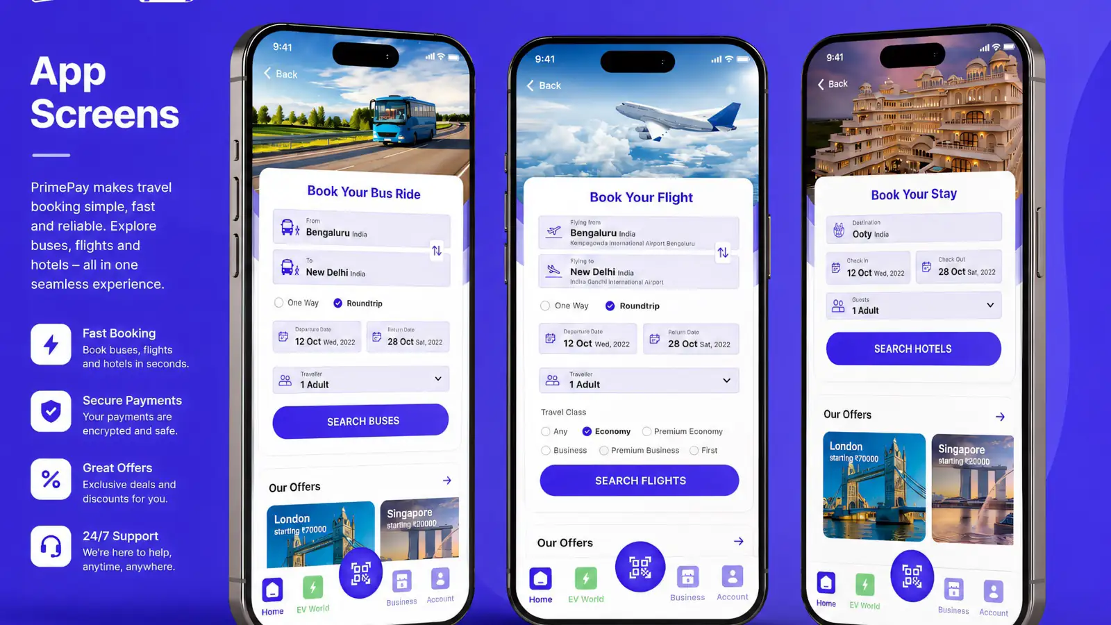
A visual design system that elevates the experience without touching the underlying journey. The work balanced 3D and flat iconography without breaking flow, used the brand's purple to hold both approachability and financial credibility, and kept clarity across languages, devices and levels of digital familiarity.
The result
An interface that carries the trust a payments product needs while staying visually distinctive, delivered inside a fixed UX with no disruption to the client's own architecture.
 Pp — Identity
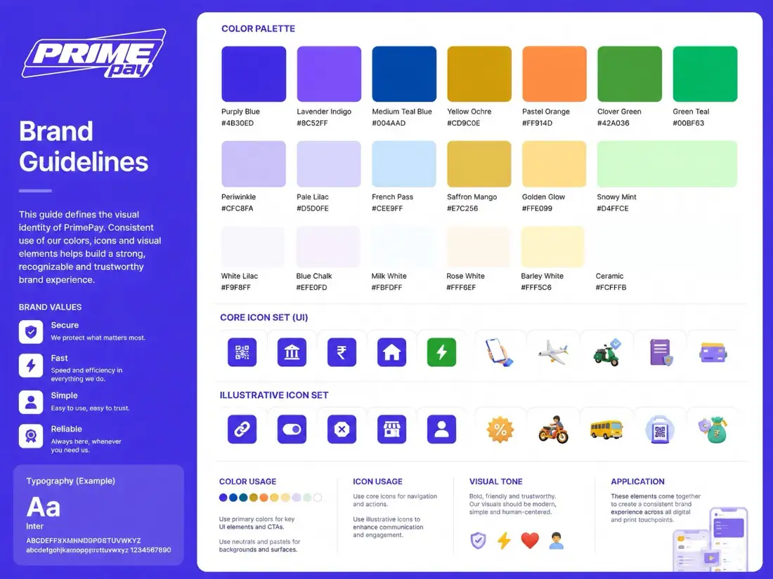 Pp — System
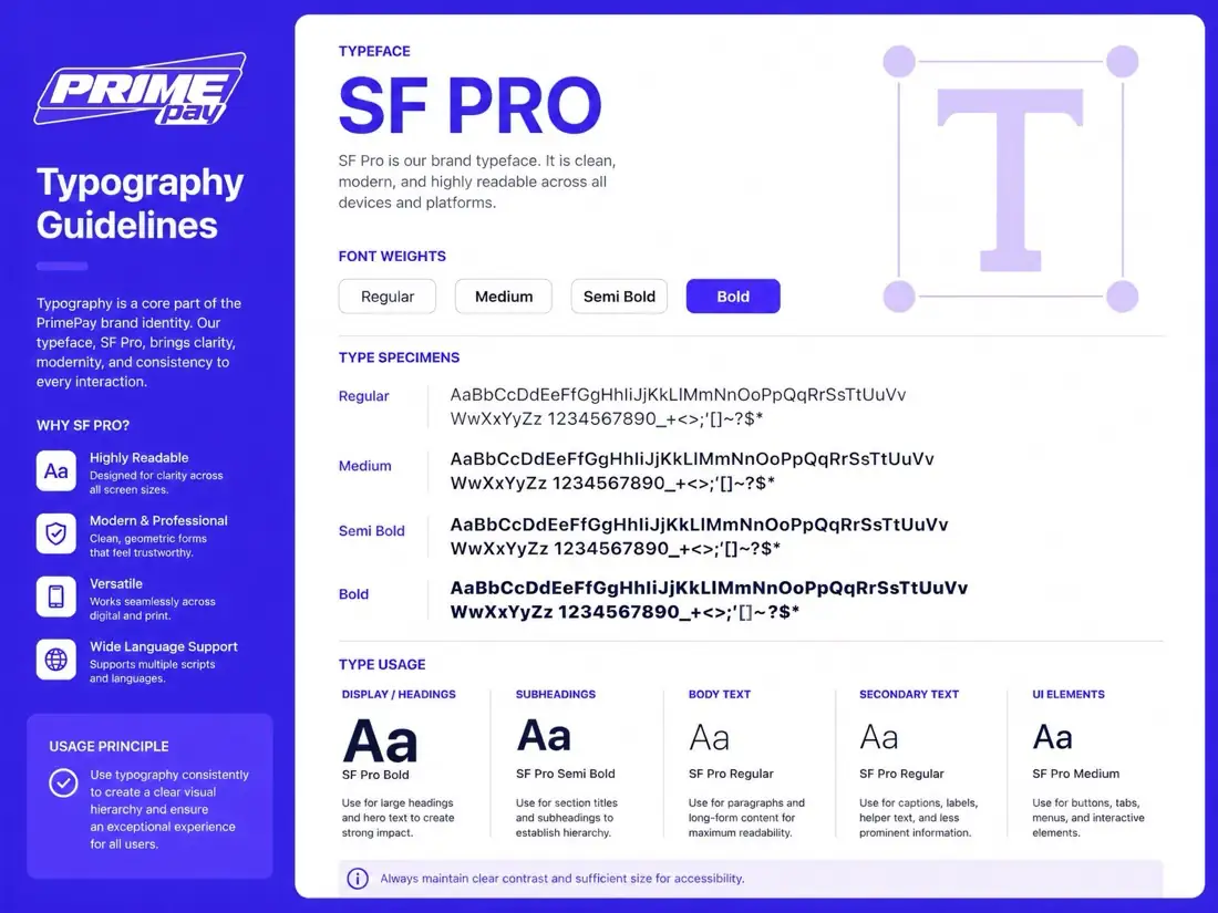 Pp — In use